A quantitative map of Gospel impact · Nationwide
Your ministry deserves
more than vibes.
Most churches make neighborhood decisions — where to plant, where to invest, where to stay — without anything to watch but instinct. GospelGraph turns census data, church density, and lived pressure into one honest reading of every block in America.
The average church plant costs $180,000 and four years of a planter's life. Most of them chose the neighborhood the same way they chose a restaurant.
What it is
A map that reads
the field for you.
Need is invisible at street level. GospelGraph makes it legible — turning census data, church density, and lived pressure into a single, honest picture of where the Gospel is reaching, and where it isn't.
- Need Pressure (GIM)A 0–100 score of how hard daily life presses on a neighborhood.
- Gospel Desert layerTracts with little or no evangelical church presence.
- Gospel Shift (5yr)Five Gospel impact domains, and which way each is moving.
Military community / thin durable presence / monitor and partner before duplicating.
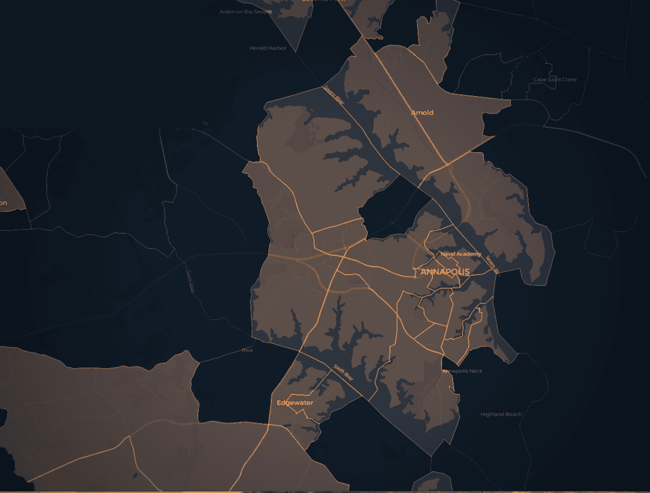
Census Tract Explorer · Annapolis, MD
How it works
Three steps from address to action.
Drop a pin
Enter an address, a city, or your church's location. GospelGraph loads every tract within your radius.
Read the map
Layers reveal need-pressure, Gospel deserts, and how each block has shifted across five impact domains.
Generate a Field Report
Walk in with a PDF brief for any tract: the wound, the people, the situations, the gap, the call.
Free · No account required
Run a Field Report
on any address.
One address. One tract. The wound, the people, the call — in five sections, generated in about thirty seconds.
Then unlock the Explorer to see every tract around it.
A sample report
Walk through
a real tract.
Tract 24033807301 · Stable Suburban Families
Reconciliation, Safety, Education, Family, Housing, Economic Opportunity, and Health are all in crisis — a pattern that points to multigenerational poverty, not recent disruption.
Across eight community domains, seven score in crisis. The deepest fractures here are not random; this is the inherited condition, not the storm.
A Stable Suburban Families tract — 3.1× more concentrated than the county. From the street it looks 'up and coming.' You'd be half right.
Three LifeMode segments share this block. The voice below is the LifeMode personality, in the report's own words.
"From the street, this block looks like it's on the way up. The new coffee shop at the corner. The houses with fresh paint and fiber internet flags. The for-sale signs that disappear in a weekend. If you drove through once and had to describe it, you'd probably say 'up and coming.' You'd be half right."
These households built the stable life they were told would be enough — and their bodies are quietly dismantling the foundation underneath it.
Three situational flags fire on this tract. They aren't single-year readings; they're the report's read of compounding conditions.
An hour's drive away there are forty-plus evangelical churches. On this tract there are none.
The Gap names the ministry distance — not in feelings, in miles, ratios, and the trajectory of the gap itself.
Presence & Proclamation — Established Families. The entry point is the burden they're already carrying, not the spiritual need they haven't yet felt.
Four postures from the report's synthesis — strategy that survives the first three years.
Inside the Explorer
Every tract, scored
and ready to read.
Hover any block to surface its need-pressure. The Explorer pairs the map with a tract card — composite score, domain breakdown, LifeMode, and direction of travel — so you can compare neighborhoods in seconds.
Military community / thin durable presence / monitor and partner before duplicating.
What changes when you can see the ground
Fewer guesses. Sharper questions. Better first moves.
Site decisions on evidence.
Choose where to plant, where to invest, and where to stay against measured need — not a borrowed gut feel.
Outreach aimed at pressure.
Point your people at the blocks carrying the most weight, and watch whether your work shows up in the data.
Partnerships with proof.
Show denominational partners and donors exactly which tract you served, what shifted, and what's still missing.
A first move on Tuesday.
Every Field Report names three concrete things to do this week. Strategy that doesn't survive the week is decoration.
Who it's for
Built for the people
deploying the harvest.
Choose your site with evidence.
Stop planting on instinct and rent maps. See measured need, church density, and momentum before you sign a lease.
Aim your people where it counts.
Point your congregation's love at the blocks carrying the most pressure — and track whether it's moving the needle.
Fund by need. Prove the impact.
Deploy people and dollars against measured need, then show partners exactly what changed and where.

From the founder
"I did not build this tool because I saw a market gap. I built the tool I wish I had before three years of incarnational mercy ministry in public housing."
B.S. U.S. Naval Academy · M.J. University of Maryland · M.Div. Westminster Theological Seminary
Engineering · Journalism · Theology — the same three habits, pointed at the same neighborhood.
Get access
Field report first.
Then unlock the Explorer.
Run one free report on the address that matters most. If the picture is true, unlock the Explorer for everything around it.
Denomination or network? Ask about institutional access →